In Oct 2018, Microsoft released the new MS Office 2019. The overall UI design changed little, but this version could be the worst in the past decade.
Unseparated Tabs
Microsoft introduced Ribbons in Office 2007 (Win Vista) replacing traditional menus. A typical ribbon includes Tabs for navigating through different command groups, and Tools Area containing command buttons.
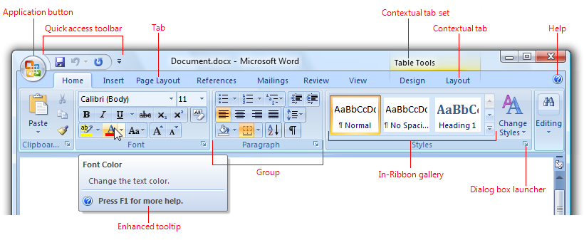
A typical ribbon in Office 2007
Ribbon is such a successful design that it survived over a decade.

Ribbons of Office 2007 and 2010
Ribbon of Office 2013

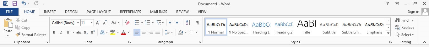
Ribbon of Office 2016

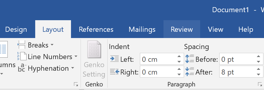
Ribbon of Office 2019
Take a look at the ribbon design of Office 2007-2016. A common characteristic is that the tab and the tools area are clearly separated (full width) — either by a line or by colour difference. But in Office 2019, only current activated tab is underscored while other tabs are indistinguishable from the tools area due to the same background color. Lacking boundary leaves the user in confusion and hesitation when clicking/touching tabs due to fear of accidentally clicking onto the command buttons below (though there is actually a wide gap between).
On the other hand, lacking of boundary above the tabs in old versions does not cause such fear, because accidentally clicking onto title bar is unlikely to trigger any unwanted commands (unless you click onto the quick-access buttons).
Tab hover in Office 2016

Tab hover in Office 2019
To make it worse, Office 2019 changed how tabs response to mouse hover. In old versions, when mouse hovers over a tab, the tab changes its border or background as an indication. However, in Office 2019, the indicator is the tab text style switching bold (a bit wider) when hovered. The background colour does change, but the difference is so subtle that it’s hardly distinguishable. Combining with lack of separation line as mentioned above, the ribbon tab design in Office 2019 is clearly badly-designed.
Mysterious Ribbon Height
This is not a notable issue. But since I commented on ribbon tabs above, I’ll also mention the ribbon height.
Ribbon of Office 2016 vs 2019, side-by-side comparison
Take a look at the side-by-side comparison. Top borders of the tabs are the same. Bottom border of the tab of Office 2019 is ~2px higher than that of Office 2016. Bottom border of the ribbon of Office 2019 is ~4px lower than that of Office 2016 (my display is scaled to 200%). This means shorter ribbon tabs and taller ribbon tools area in Office 2019, as well as shorter main area.
This seems to be the result of redesign of command buttons which requires more space. However, from personal preference, I would rather have smaller buttons in exchange for larger main area.
Command Icons For Special People
The most notable UI changes are those command icons on the ribbon. The line-and-shape style in old versions is switched to an outline style.
At first glance I thought I accidentally turned High Contrast option on, until I realised the Office UI was updated (I subscribed to Office 365).
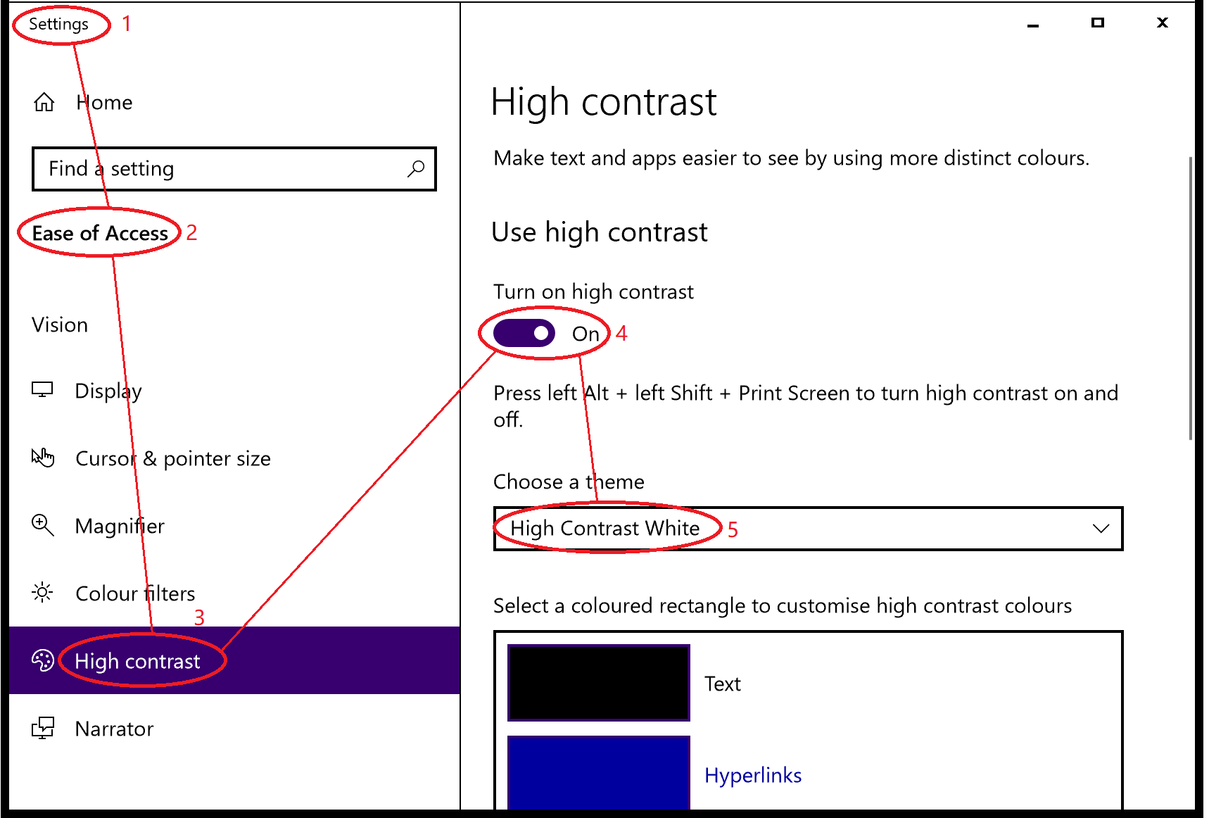
High Contrast option in Win10 Settings
For you information, High Contrast option is one of the Accessibility features for special people with visual difficulties. Even in Win98 there was already high contrast color scheme.
Office 2016 in High Contrast mode
Bing Search in High Contrast mode
In High Contrast mode, many vector icons are displayed as outlines. Dark background color and thick underline (like that of new ribbon tabs) replace the slight background color change.
I heard that Microsoft was adopting "Fluent Design" recently, but didn’t expect such strange design. I checked the docs and, okay, it is really part of the Fluent Design.
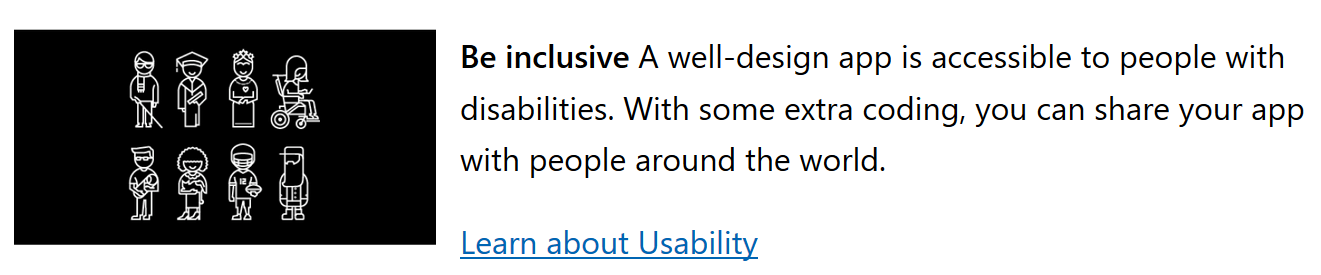
The Fluent Design suggest to Be Inclusive
Caring for special people is a humane idea. The problem is the outline style icons increase pain for ordinary people.
Firstly, the outlines & fill is less expressive and flexible than the combination of lines & shapes. New icons looks similar while the old ones are more diversified.
Secondly, the outline style requires heavy stroke (2px in 200% scaling) while line-and-shape style may used lighter lines (1px in 200% scaling). This could be the reason that the tools area in Office 2019 is taller than the old versions.
![]()
Comparison of Paragraph icon group
Combining these two points results poorly-designed icons. For example, the Align Left/Center/Right/Justify icons now have much wider line spacing and resemble Bagua (the Eight Trigrams). It becomes overly obsessing when several 4-line icons with large line spacing are gathered together.
While the outline strokes style is more patent in Office 2019, the color of text under the group is surprisingly paler (nearer to grey) than the old versions, which seems contrary to the accessibility inclination.
In short, the new design of Office 2019 is quite odd and less efficient. For a tool of productivity, such design is obviously a fail compared to successful creative designs of the former versions.